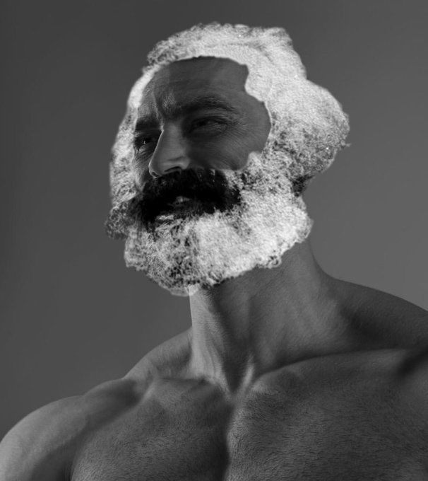
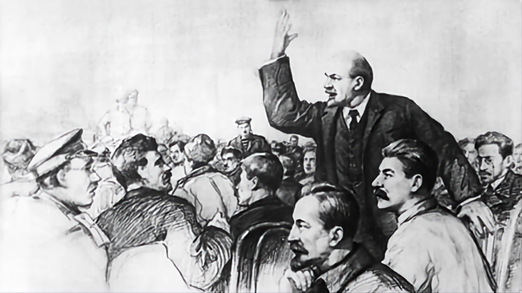
Also this image is in the header

Am I tweaking?
For those who couldn’t see what I was referring to about the dates: I know this one is a stretch, but alongside the lightning bolts that TPUSA doesn’t use literally anywhere else or have any campaign/slogan relevance, it’s suspect. Definitely minor in comparison but worth noting given the much more blatant surrounding context


I’m a graphic designer, and it’s highly unlikely that they could find a decent designer who was willing to work with them for the same reasons that Hollywood and comedians tend to lean left: it takes empathy to understand your audience well enough to cater to them at a level that they engage with. It’s the same reason that the right has one joke. Their form of humor only extends as far as saying something inflammatory and then asking incredulously “What, are you offended by that?”, and that deliberately circumvent the need for empathy. Design works the same way. You need to understand not only how people think, but why people think that way in order to make something that appeals to them.
Organizations are using the best they can get, and it’s slim pickings. They often try to make up for it by using AI-generated images, which is why AI is the official art style of fascism.